
In times of picture-driven internet, where we are hunting for various kinds of infographics, animations, and chart, books prove they are a highly inspiring topic for visual design.
[ef-archive number=2 tag=”lists” ]
Many of these visualizations are possible thanks to the internet and digitization.
As soon as the book goes digital, its entire content can be analysed like never before. Creators can include much more data in the analysis, what leads to breath-taking visuals.
Let’s just take a tool every internet user can utilize: Google Ngram Viewer. You can track the appearance of selected words in books over time. A simple idea to make infographics like this one: Love DNA of classic novels.
Processing the information is important, but nothing will replace the talent of a designer to present the data in a clear and exciting way.
You’ll see below the greatest examples of data visualization applied to books, but not only that. Having unlimited access to images on the internet artists can create collages that represent the content of a single book or entire book genres. In the list below you’ll see such examples as well.
Please share in the comments the projects that should be highlighted. I’ll add them in the next update of the list.
[ef-reco id=”100684″ title=”Read also” info=”Top article”]
16 amazing book charts and visualizations
1. A guide to fiction genres

“A Plotting of Fiction Genres” chart is epic. It investigates the genres of most famous books and puts them together in a catching visual.
Whether you’re partial to Epic Fantasies (“The Lord of The Rings), Romance (“Bridget Jones’s Diary”), Cozy Mysteries (“The Convivial Codfish”), or Literature Qua Literature (“Moby Dick”), this celebration of creative writing’s delineations is sure to please readers of all brows—whether high-, low-, or in-between.
The book covers you’ll find in the design are fictional. The team from Pop Chart Lab designed them for the main fiction genres, like science-fiction, mystery, or horror.
From there you’ll be able to follow sub-genres – each one represented by the most famous title.
2. Character interactions in Shakespeare’s tragedies
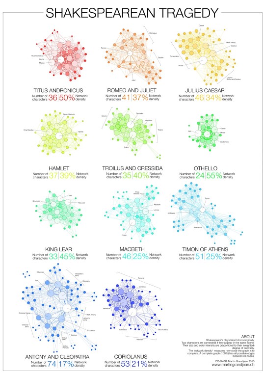
A series of fascinating network graphs created by a Swiss data research analyst and designer Martin Grandjean explores the structure and character interactions of eleven classic tragedies by William Shakespeare.
Each chart presents all characters from a specific tragedy. Each character is represented as a circle. The more important the character the bigger the circle.
The lines connect characters to other characters with whom they interact in the same scene. Network density measures how close the graph is to complete.
The result speaks for itself: the longest tragedy (Hamlet) is not the most structurally complex and is less dense than King Lear, Titus Andronicus or Othello.
When you analyze the graphs, you’ll see that in some tragedies characters belong to clear groups. It’s obvious with Romeo and Juliet, where we have Montague and Capulet families.
3. YA reading calendar

This calendar with YA book recommendations is epic. It’s not only a useful tool that lets discover new books, but also an extremely detailed and well designed visual.
The 2015 YA reading calendar brakes down YA books into seasonal, monthly, weekly and daily recommendations. Separate charts for seasonal reads were also prepared by Epic Reads team.
This infographic marks the beginning of the new breed of discovery tools – the ones that put recommended titles into an advanced, visually catchy form that is much more enjoyable to explore than a mere collage of book covers.
It’s not the first creative design from Epic Reads, and I’m sure we can expect a lot more from this YA-focused book community.
4. Opening lines of famous novels

This is one of the most stunning designs from Pop Chart Lab. The chart brings the most exciting analysis of what many book lovers consider the most exciting part of the book: opening line.
Diagrammatical Dissertation on Opening Lines of Notable Novels breaks down grammatical construction of opening sentences of 25 famous novels.
Each sentence is diagrammed into a partitioned, color-coded pictogram, according to the dictates of the classic Reed-Kellogg system.
Whether you’re a book buff, an English teacher, or a hard-line grammarian, this diagrammatical dissertation has something for the aesthete in all of us.
5. Plot Lines

This is one of the most beautiful examples of literary visualizations I’ve ever seen – and it actually gives a very useful advice for every aspiring author.
What’s the best recipe to make your novel a bestseller? Kill off your characters.
The infographic was developed by Joanna Kamradt and Christian Tate for the literary magazine “Delayed Gratification”. It analyses the plot of 13 novels that won the prestigious Man Booker Prize in 2011.
Every single title includes death – the black part of the chart is overwhelmingly large.
6. Narrative structure of books

What you see above is just a teaser – a screenshot of an interactive visualization of narrative flow of Kafka on the Shore by Haruki Murakami.
The visualization was developed by Natalia Bilenko and Asako Miyakawa, neuroscience PhD students at UC Berkeley.
A dynamically changing graph studies connections between characters throughout the book. Emotional strength and valence of each sentence are shown in a color-coded sentiment plot.
When you hover over the sentence bars, you’ll see the text of the original sentences.
7. Color signatures


Artist and designer Jaz Parkinson created a wonderful art project called “Colour Signatures”.
Famous novels are presented in a form of posters/book covers, where colour spectrums are a reference to colours used in novels’ content.
Jaz explains more how the colours are found:
For example when it might say ‘yellow brick road,’ ‘yellow’ gets a tally, or when for example in The Road it says ‘dark ash covered everything’ (not an actual quote), that image evokes dark grey instantly in the mind, so dark grey gets a tally.
8. Romeo and Juliet poster

Created by Saloniki-based design studio Beetroot, the poster links with red ink all instances of words “Romeo” and “Juliet”.
The word “Romeo” appears 308 times in William Shakespeare’s most famous tragedy, “Juliet” – 180 times. That makes 55,440 connections.
Designers from Beetroot included all these connections in the poster, creating an attention-drawing visual, evoking feelings of love and blood.
9. Connections between characters in Infinite Jest

Infinite Jest is a lengthy and complex 1996 novel by David Foster Wallace, full of cultural references, and exploiting deep multilevel relations between characters.
Designer Sam Potts took an attempt to visualize complex connections between characters from the book in a single chart.
The diagram doesn’t explain the story or show the advance of the plot. It’s just a sheer representation of how intense the narration in a single book can be, as seen through the plethora of connections between characters.
10. Top 10 bestsellers from 2000-2011

This awesome image includes every book from USA Today Top 10 weekly bestseller lists from 2000-2011. More than 6,000 book covers are shown, from 1,300 individual books.
The visualization was created by James R.A. Davenport, astronomer and social data analyst. He wrote a special script that was grabbing book covers every week.
If the book cover stands for the mood of the book, this chart is a fantastic way to see how our reading preferences evolved over time.
You can see the “decay time” of books as they drift off the bestseller list. Color choices seem to have become more saturated since 2000, and Twilight (big black band) is the undisputed champ.
11. Thematic flow of a book

In an image above you’ see the visual representation of A Year and a Day, a romance based in medieval Scotland, written by the New York Times bestseller author Virginia Henley.
The visualization is the outcome of a very interesting initiative by BookLamp and the Book Genome Project. A special algorithm was developed to analyze the topic and writing style of a book.
Such visualizations become a new, and very valuable, addition to book’s blurb, ratings and reviews. They fantastically describe (“display” would be a better word) what you can expect from a book, and how the plot evolves.
12. Color distribution of YA covers

YA writer Kate Hart wrote a great post uncovering YA covers. The post is accompanied by a series of images (one of them you see above, but there are other interesting ones to explore).
Kate gathered more than 900 books released in 2011 in United States. Then she researched the color distribution and demographic of these books.
13. Penguin sci-fi book covers over time

Arthur Buxton put together the most common colors of Penguin Publishing sci-fi books and arranged them over time. It’s interesting to see how iconic Penguin book cover art was evolving over time.
Each timeline represents all the iterations of a cover in chronological order.
Within each bar chart, length corresponds to the time in print and the dive most prominent colors are shown proportionally.
14. Connected words of 1984

“Connected” is a work of art by Greg Orrom Swan. The Bristol-based artist and designer connected the letters in the first two paragraphs of George Orwell’s 1984.
The image is a part of the larger art project called “Five Ways to Read 1984”.
15. Literary Organism

Stefanie Posavec created an astonishing Writing Without Words project that analyzes writing styles of famous authors between authors.
The visual you see above is “Literary Organism”. It analyses in detail Jack Kerouac’s On the Road. It’s a simple organic structure that breaks down Part One of the book.
The chart breaks into chapters, chapters into paragraphs, paragraphs into sentences, and sentences into words. Everything has its own color according to key themes in On the Road.
16. The Great Gatsby chapter by chapter

Here is another visual from Pop Chart Lab. This time you can analyze, chapter by chapter, the plot in The Great Gatsby.
The graph traces the comings and goings of characters, but also movement by trains, cars, and feet – for Daisy, Nick, Tom, Gatsby, and every other character in the novel.
A map at the top of the chart also shows the 20s New York locations of scenes in the book.
• • •
To get more posts like this, please subscribe by RSS or email. Let’s also connect on Facebook, Twitter, and Pinterest.
More lists to explore:
[ef-archive number=5 tag=”lists”]


